Thrive
UX/UI Design | Capstone Case Study
Thrive is an iOS app designed to help women take control of their financial future. The app generates personalized investment portfolios based on the user’s unique life circumstances. Users can invest based on their goals and gain financial education throughout the process.
Project Overview
Project: Academic Capstone
Team: Solo
Role: Researcher | Design Strategist | UX/UI Designer
Timeline: 8 weeks
Tools: Figma | InVision | Adobe Photoshop
Platform: iOS
As part of an immersive UX design course, I was tasked with producing a digital solution to any existing problem space. I chose to create an app for investing that also provides financial education. The project was an end-to-end UX design process that included research, ideation, testing, interface design and a hi-fidelity prototype. I went on to design a marketing page for web and mobile, helping to introduce the product to prospective users.
Design Process
To ensure that I was approaching this project with my users in mind, I used the design thinking process. Through this human-centered approach, I worked through the phases of understanding, exploring and materializing a solution for testing.

Empathize
Problem Space | Secondary Research | Primary Research
Problem Space
Financial health matters. As someone who has struggled with lack of financial literacy, I wondered if others shared the same frustrations. This project was the perfect opportunity to explore the space of financial literacy and investing among Canadian women.
I learned that for women, financial planning comes with a unique set of considerations, for example longer life spans, time off to care for loved ones and gender pay gaps. There isn’t an all-in-one solution that appeals to Canadian women and offers them personalized financial knowledge and products in order to efficiently build their wealth.
Secondary Research
Through my research, I discovered key challenges that women face when planning their financial future. This data verified that the problem space was a compelling issue.
According to Statistics Canada, women have lower levels of financial literacy and are less confident in their ability to manage their finances than men.
50% more women than men said they aren't investing because they don’t know how to get started.
When women aren’t investing, it compounds the pay gap dramatically over time — women are on track to end up with less money when they need it.
Sources: Statistics Canada | Wealthsimple | NBC News
Primary Research
User Interviews
To dive deeper into the problem space, I conducted several remote user interviews with women between the ages of 25-45 who value financial health. I asked 14 open-ended questions relating to how they manage their finances to better understand their common pain points, motivations and behaviours.
I analyzed my users’ answers by sorting them into an affinity map and synthesized 3 main themes.
Financial Knowledge
Women don’t have enough knowledge to effectively plan for a secure financial future.
Investing
Many women don’t fully understand investing and therefore aren’t investing enough or investing at all.
Technology
Current digital products for managing finances lack efficiency and don’t cater to women’s specific needs.
Define
Design Challenge | User Persona | Experience Map
Design Challenge
Having pinpointed who I’m designing for and where my design solution could be of help, I developed a How Might We statement to help inspire innovative ideas to solve problems found during user research.
How might we guide Canadian women to find helpful tools and resources in order to plan for a secure financial future?
User Persona
Using my research findings and data from the interview participants, I developed a persona to represent my target user. I referenced the persona throughout the design process to ensure I was making design decisions with my user in mind and creating an empathy-led solution.
Meet Charlotte! A young professional who is looking to expand her knowledge of personal finance and investing and take steps toward planning for her future.
Experience Map
Next, I put together an experience map to understand Charlotte’s current journey when trying to invest for retirement. By defining each stage of her experience, I was able to identify areas of opportunity for my design solution to intervene.
Ideate
Task Flow
Task Flow
I decided to focus on the core themes of Financial Knowledge and Investing for my main task flow. Based on my secondary research and interview findings, I learned that while lack of financial knowledge is an issue for women, not investing is their biggest barrier to growing wealth. I felt it was important to address both of these issues in my digital solution.
I created a task flow diagram to show how Charlotte would open and fund an investment account. My challenge was to figure out how I could provide Charlotte with opportunities to gain knowledge during the investing process.
Prototype
Sketches | Mid-fidelity Wireframes
Sketches
With my main task flow in mind, I referenced existing UI components and other financial apps and created a UI inspiration board. Knowing the core features and functions to include, I then took pencil to paper and sketched out several versions of key screens. Continuous iterations were made to improve the app’s functionality and user experience, eventually producing the first prototype.
Mid-Fidelity Wireframes
Next, I converted my paper sketches into grey-scale mid-fidelity wireframes using Figma and created a working prototype. By working with mid-fi wireframes, I was able to quickly test out layouts and components before introducing visual identity and moving into high-fidelity wireframes.
Test
Usability Testing | Improve Design
Usability Testing
I prepared for usability testing by creating a test plan and test script to ensure a smooth experience for my participants. I conducted 2 rounds of remote usability tests with 5 participants per round. The results provided key insights into the user’s experience of the app and how it could be improved.
Given the time constraint, I created a design prioritization matrix to help determine what changes should be prioritized.
Improve Design
Referring to the design prioritization matrix, I could see that most of the issues would require low effort to fix but bring high value to the user. For this reason, I decided to tackle all 8 issues to make the biggest impact on improving the app.
ONBOARDING SCREENS COULD BE USED TO EXCITE + INFORM
Initial: A simple welcome screen.
Revised: Feedback from my peers helped to inform my design decisions for the onboarding screens. There was an opportunity to better inform the user and get them excited about investing. Illustrations were added to better communicate concepts.
TEXT SHOULD BE BIGGER + QUESTIONS SHOULD REMAIN ON SCREEN
Initial: Due to its size, users found the text hard to read. On the ‘Forms’ screens, most users wanted to see the questions after inputting their answer to refer back to and ensure they were answering correctly.
Revised: Adjusted the size and colour of the font and kept questions visible.
GRAPH/TAPPABLE TEXT SHOULD BE CLEAR + ADD OPTION TO LEARN ABOUT FUNDS
Initial: The graph wasn’t easy to comprehend. Users didn’t realize they could tap to learn about the stocks and bonds in the portfolio.
Revised: Added elements to clearly communicate the portfolio and made the tappable link more apparent.
CLEARLY COMMUNICATE + SIMPLIFY THE PROCESS FOR THE USER
Initial: All of the account options were listed together. Users were confused that there were multiple options even though the app had suggested an RRSP. User’s didn’t notice the ‘Learn More’ button.
Revised: Separated the suggested account type while still keeping other available options visible. Replaced the ‘Learn More’ button with a question mark icon that the user can tap and view a pop-up box to read about the other account types.
OMIT UNNECESSARY STEPS
Initial: The “Link your bank account’ screen was an additional step for the user that wasn’t needed.
Revised: Simplified the flow for the user by bringing them directly to the bank listings screen.
ADD SCHEDULE WHEN FUNDING INVESTMENT ACCOUNT ON RECURRING BASIS
Initial: There was no schedule option for the recurring investment option.
Revised: Added the option to schedule recurring investments as weekly, bi-weekly, monthly, quarterly, etc.
Implement
Visual Identity | Hi-fidelity Prototype
Visual Identity
With a tested and refined prototype, I was ready to introduce the brand and visual identity and start designing the hi-fidelity prototype.
Through my research, users expressed that many financial apps have busy interfaces, showing numbers and graphs that are difficult to understand, leaving them feeling overwhelmed and put off. With this knowledge, I decided the UI should be modern and clean.
Referring back to my persona Charlotte, I wanted the brand to be positive and encouraging, like getting advice from a friend. I went through several brainstorming sessions to develop the brand identity and ideate on how the brand’s voice could be communicated visually.
High Fidelity Prototype
After testing, multiple iterations, developing the visual identity and colour injection trials with consideration for the 60:30:10 rule, I was ready to produce the high-fidelity prototype. I made accessibility a priority, ensuring my colours had high contrast meeting WCAG’s AAA Accessibility Standard.

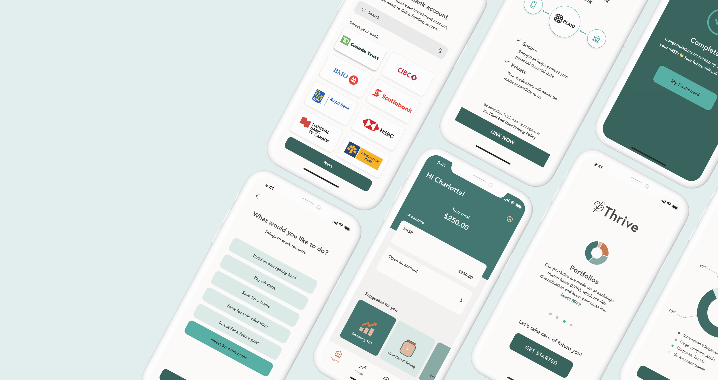
Key Features
Thrive was designed to address the current pain points associated with investing, meet user needs and get more women investing through a simplified process. Through the UX design process, I was able to pinpoint these key features.
FEATURE 1
Seamless onboarding
Get familiar! Learn about Thrive’s mission, what it offers and how it’s going to benefit you.
FEATURE 2
Goal-based investing
Simplify the process and start your investing journey by defining your goal. Let Thrive do the work by guiding you to the best funds and account types.
FEATURE 3
Get a personalized investment portfolio
Thrive will create an investment portfolio that is tailor-made to your unique circumstance.
FEATURE 4
Open an account without all the fuss
Go paperless! Open an account directly in the app without all the paperwork.
FEATURE 5
Securely link your bank
Thrive uses Plaid to securely link your bank account while keeping your credentials private.
FEATURE 6
Choose how to invest
It’s all about options! Choose how you’d like to invest and pick an investment schedule that’s right for you.
FEATURE 7
Expand your knowledge
Continue learning with curated articles and workshops accessed directly from your dashboard.
Moving Forward
Responsive Marketing Website
To explore the product from a business and marketing perspective, I designed a responsive website for desktop and mobile to highlight its key features to potential users. Through this process, I learned the importance of product marketing and how to build designs for both platforms.

Business Perspective
There is a large potential for business by creating a financial product that is marketed specifically to women. Women make up more than half the workforce, they drive a large portion of consumer spending and they’re now earning more than ever before. Simplifying the investing process and providing financial education in order to increase customer conversion is a win win.
There are many financial products on the market. What makes Thrive different?
Access to personalized financial products: the algorithm takes into account the user's unique life circumstance. Portfolios are based on the user’s information and tailored to their specific needs
Easy goal-based investing: simplifies the process of investing by starting with the user’s goals
Financial education: incorporated into the app at all stages of interaction, with the opportunity to dive deeper through tappable links and the learn section
Next Steps
With more time, I would…
Add animations to the app and include more interactive graphical elements to communicate potential growth
Build on the learning section of the app
Explore opportunities for community building and investing in sustainable, environmentally and socially responsible initiatives
Key Learnings
This was my first UX project and it was such a rewarding experience! My biggest takeaways were the value of testing early and often, how design systems can inform strong design and the importance of research and empathy when it comes to building impactful products. I learned how to pivot when needed, set realistic goals and be open to sharing work in-progress to improving the product.